
Art Classes with Marc Surrency


Color Wheels
1. A Quick Review of the Previous Page
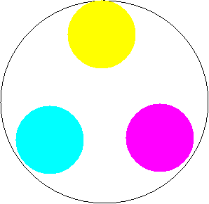
So what did we learn from the previous page? We learned that the mixing theories for light aren't transferable to pigment! We learned that all of the colors we see can be reproduced using Red Green and Blue (RGB) light. We can record the RGB light being reflected by the object and then print an image that reflects RGB light in the same manner, using cyan, yellow, and magenta ink. We'll see more of this relationship later, so keep it in mind.
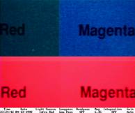
We also learned "Color... is the result of the physical modification of light by colorants as observed by the human eye (called a perceptual process) and interpreted in the brain (which introduces psychology)."(Meyer, p1) To be able to define a color we also need to define the light source. For example the two inks below look the same under one light source, but are obviously different under another light source this is called mettamerism.
The red and magenta inks in the top of the photo are under one type of light where they appear completely different. In the bottom of the photo they are under another light where they look very similar.
So it's important that if we're trying to match colors use the same the light source that will be used for viewing. For artists it also means that the colors in our paintings may appear different under different light sources.
That being said, our brains will do an auto correction if the entire painting is painted under one type of light, but shown under another type. For example, let's say you paint an object that we are familiar with such as an American flag using natural sunlight. If you bring the painting inside and use an incandescent light to illuminate the painting, the light will cast a warm orange tint onto the painting. Your brain will compensate for the color shift of the illumination and the white stripes and stars will still appear white, even though they have a strong orange tint from the light.
The main focus of the previous page was on describing colors and then being able to recreate or match those colors using a coordinate and precise mixing system. Most of us don't paint by numbers, but we still need to know how to successfully mix the colors we need or want. We'll now move on to the various geometric models favored by artists.
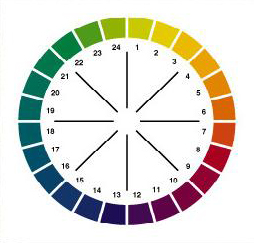
2. Two dimensional Color Geometry - The Color Wheels
In the previous page the we explored many different color geometric models which are also known as color solids. We found that most color solids are formed by creating a circle out of the visual spectrum by connecting the ends of the spectrum (blue and red) together, which becomes an equator of hues (such as red, orange, yellow, green, blue, etc.). The third axis is created by a line passing through the polar axis, and represents brightness ranging from black through tones of grey to white (value). As colors shift from the center of the solid toward the edge, they become more saturated or "stronger" (chroma). Two well known and used solids were created by Ostwald and Munsell.
Ostwald's color solid and cross section

Munsell's solid, pole view and cross section section
As we found out, all of those color solids were of course three dimensional and in fact so are the artists color wheels. Typically artist only deal with the cross section of the color solid that contains the hues at full saturation. This of course makes sense, since the paints coming from the tubes are at their highest saturation.
3. The Triad Color Wheel
Historically artists have begun their color studies with the triad or three primary color wheel. Theoretically, it is possible to recreate all of the colors of the rainbow using three primary dyes (cyan, Magenta, and Yellow).
The Subtractive Color Wheel
However, the color space of these dyes and their absorptive properties have to be carefully balanced and life is rarely perfect.
Most of the color spaces and subsequently color wheels were developed for textile dyes. However, most dyes aren't very light stable and three hundred years ago weren't used in making paints. Pigments were used for the colorant material for paints. The light properties of dyes and pigments are very different, so that introduces more problems for the artist trying to use a color wheel developed for other purposes. Which brings up another point. Technically a color wheel made of watercolor paints that are composed of dyes isn't applicable for mixtures of watercolor paints that are composed of pigments. Also, technically a color wheel developed for use with transparent dyes or pigments isn't applicable for mixtures using opaque pigments. But were getting ahead of ourselves and we'll find that most of these "technical" issues can be lived with. So the first problem is that the first color wheels weren't created for pigment based paints.
Here's the next problem. Cyan paints weren't really available and magenta paints weren't light fast up until the 20th century. You might say, well big deal, according to the subtractive color wheel above you can mix blue and green to get the primary cyan. Wrong. The primaries are called primaries because they can be used to create the other colors, but the reverse is not true. if you take the two secondary colors blue and green and mix them together you will get a cyan, but this mixture can never be as saturated nor as bright as the primary cyan. The term "subtractive" in this color wheel underscores that you can only take away color intensity by creating mixtures, you can't add to it. Try it for yourself. Take any color and mix another with it. The resultant color will always be less saturated ("grayer") than the original colors. The addition of black or white paints have the same affect, the resultant mixture with a color is always less saturated.
Since cyan and stable magenta paints weren't readily available before the 1900's, artist were left to use blue, yellow, and red for the primaries. Luckily there aren't that many things in nature that are highly saturated cyan or magenta. But the use of blue and red in place of cyan and magenta shrink the color space and thus the colors that are possible from their mixtures. These substitutions also make the color wheel less successful in predicting the outcome of mixtures.
We'll look at both of these triad color wheels: Blue-Yellow-Red and Cyan-Yellow-Magenta. We'll first look at the theoretical arrangement and then we'll discuss the reality of the situation. Although we've already discussed some of the limitations, we'll also discuss some of the strengths and weaknesses.
One disclaimer before we begin. The colors on the wheels are representational. They are represented here only for clarity in our discussions. For them to be displayed accurately both of us would have to do more work then I care to do. We would have to have you calibrate your screen, I'd have to create calibration tools, etc. So don't get too hung up on the colors on your computer screen. I've used Microsoft's version of red, blue, etc. For example the microsoft's red looks too warm and almost like cadmium red to me, but we're going to go with it.
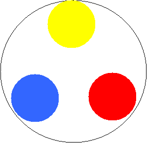
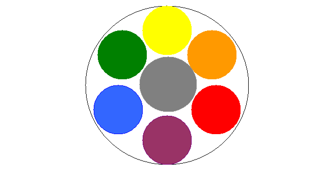
The Blue-Yellow-Red triad color wheel has blue, yellow, and red as the primary colors.
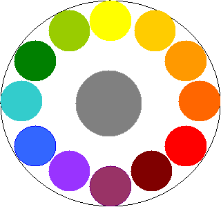
By mixing each primary color with one other primary color, a secondary color is created. Red is mixed with yellow to create orange; yellow is mixed with blue to create green, and red is mixed with blue to create violet. Therefore, the secondary colors are orange, green, and violet. By mixing the three primaries together or a primary color with the secondary color directly across from that primary color the resultant mixture is grey.
In similar fashion, by mixing one primary with an adjoining secondary color, a tertiary color results. The tertiary colors are mixed as follows:
yellow + orange = yellow-orange
red + orange = red-orange
red + violet = red-violet
blue + green = blue-green
yellow + green = yellow-green
By mixing any color with the color directly across from that color will result with a grey mixture
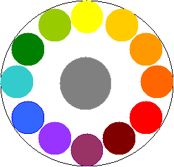
The result is the Twelve Part Color Wheel developed from the primary colors blue-yellow-red primary colors
By mixing any color with the color opposite of it on the wheel, the color can be desaturated (grayed down) Try it. So if we mix green with red we should get grey. Same thing with blue and orange. Did you get grey? You might have. I won't know from this end. I can't necessarily predict your outcome. See here's the reality. Which red, yellow, and blue did you use? Further, are we using dye based paints, transparent paints, pigment based paints? It all matters. If you choose the right combination of primaries, when you mix green and red together you'll get grey. If you didn't choose the right combination of primaries, you'll get a brown, ranging from a rich very deep brown to a dull mustard color brown. This result can lead to a lot of frustration for the student and lack of understanding and faith in this color space.
So where did we go wrong? There have been several simplifications and alterations to this color wheel. We already discussed that changing the primaries from cyan, yellow, and magenta, to blue yellow, and red limited the number of colors that could be mixed, but the substitution also skewed the placement and relationship between the colors located across from each other on the wheel, thus the brown instead of grey result. Additionally instead of locating the colors in their proper three dimensional relationship based on value (light to dark) and chroma (saturation level), the colors have all been placed artificially into the same plane on the wheel as they came out of the tube and placed at the edge of the wheel implying they all have the same saturation, which is unlikely.
Other limitations occur because most paints that fall into blue, red, and yellow hues are not neutral. Not having a set of neutral primaries will create errors in a color wheel predictions. Artist describe colors that are not neutral as "cool" or "warm" denoting temperature. The use of these terms are likened to the psychological experience of color and not any scientific use of the same terms for color. Remember perhaps the most critical component of color is the perception by the mind. The color descriptions "cool" and "warm" are also used by psychologists in describing color perception and processing. I've spoken with several engineers and scientists who paint on the side and have never understood what the artists were talking about when they say that a color is cool or warm, such as a bluish green is a cool green, while a reddish green is a warm green. As a chemist, I understand their confusion. See, when you ask as scientist which is warmer: a reddish color or a bluish color, they'll probably reply that a the bluish color is warmer, just the opposite of what the artist would say. The reason is that the scientist is thinking of color from light emission (black body color temperature), like when a piece of metal is heated. It starts off red and as it gets hotter its color moves toward bluish white. When the artist is speaking of color temperature, he's speaking of its psychological impact. When a yellow or red has a hint of blue they are considered to be cool. When a yellow has a hint of red or likewise a red has a hint of yellow they are considered warm, all are based on how they make you "feel" psychologically.
Now for some strengths! Using only three primary colors to create all of the other colors automatically makes the colors in the painting harmonious and tuned to each other. None of the mixed reds will clash with each other and the same is true for all of the other colors. Also, its very easy to match colors or recreate mixtures. There are only so many greens that can be mixed from one yellow and one blue hue paint. Also if the right paints are selected as primary colors, one hue will not overpower another hue. Finally perhaps one of the most powerful advantages is that by forcing the artist to create all of the needed colors from mixtures of only three paints, the artist gains an in-depth understanding of the various color mixtures that are possible from those three colors. Once those three primary color paints are mastered, the artist can replace them with a new selection and gain more knowledge.
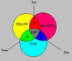
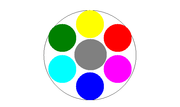
The Cyan-Yellow-Magenta triad color wheel has Cyan, Yellow, and Magenta as the primary colors.
By mixing each primary color with one other primary color, a secondary color is created. Magenta is mixed with yellow to create red; yellow is mixed with cyan to create green, and red is mixed with cyan to create blue. Therefore, the secondary colors are red, green, and blue; the primaries of the additive color wheel for light! By mixing the three primaries together or a primary color with the secondary color directly across from that primary color the resultant mixture is grey.
In similar fashion, by mixing one primary with an adjoining secondary color, a tertiary color results. The tertiary colors are mixed as follows:
yellow + red = orange
magenta+ blue = purple
magenta+ red = magenta-red
cyan + green = cyan-green
yellow + green = yellow-green
By mixing any color with the color directly across from that color will result with a grey mixture
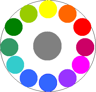
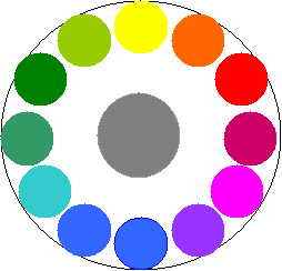
The result is the Twelve Part Color Wheel developed from the primary colors cyan, yellow, and magenta primary colors
Notice that the relative locations for the same colors are different for this wheel verses the blue-yellow-red wheel. The difference may seem subtle, but it's very significant. Lets look at the two wheels side by side.
 |
 |
||
 |
 |
Remember our mixture of green with its complement (the color opposite of it on the color wheel)? Using the blue-yellow-wheel, that color combination would be green and red. Did you get grey or brown? If you use the cyan-yellow-magenta wheel the combination would be green and magenta. Different colors, thus different results. You still have to have the right paint selection for the primaries.
So which colors should we use as the three primaries? Ask a room full of artists and you'll probably get a room full of different artists. Two things before we go on. Color names are generic and one company's Phtalo blue may or may not be the same color as another company's. The color of a paint is best described by the identification of the pigment in the paint (we'll talk about this in more depth in the paints section). However, even paints with the same pigment identification may not appear as the same color. The pigments may have different oxidation ratios or particulate size which can change the color. That said, don't over worry about it, just be aware of it. Try as many combinations as you can, you'll learn a tremendous amount about the mixtures of your colors.
Here are some suggestions.
|
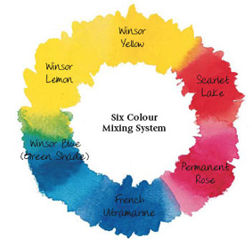
Winsor Newton suggests the following paints for a triad primary color wheel |
Artists' oil color: Transparent yellow, Winsor Blue (red shade), and Permanent Rose
Artists' water color: Winsor Lemon, Winsor Blue (red shade), and Permanent Rose
Finity Artists Acrylic Color: Azo Yellow Medium, Phtalo blue Red Shade, and Permanent Rose
Artisian Water Mixable Oil Color: Lemon Yellow, Phatlo Blue (red shade) and Permanent Rose
Artists' Oilbar: cadmium Lemon, French Ultramarine and alizarin Crimson
Griffin Alkyd Fast Drying Oil Colour: Winsor yellow, Phtalo Blue and Permanent Rose.
Designer's Gouache: Primary Yellow, Primary Blue and Primary Red (imagine that! -ms)
Winton Oil color: Cadmium Lemon Hue, Phtalo Blue and Permanent Rose.
Cotman Water Colour: Lemon Yellow Hue, Intense blue and Permanent Rose
Galeria Flow Formula Acrylic: Lemon Yellow, Winsor Blue and permanent Rose
(Colour Mixing, Winsor and Newton, 2007)
|
Gamblin has the following suggestions for oil paints: |
"To paint in the Classical tradition, look for colors near the neutral core of Color Space, including Naples Yellow Hue or Yellow Ochre, Raw Sienna, Venetian or Indian Red, Terre Verte. Consider using Flake White Replacement instead of lead-based whites."
"The 20th century color revolution gave us Phthalo Blue and Green, the Hansa Yellows, Napthol and Quinacridone Reds. All colors of very high intensity and transparency, the modern colors are found on the outside edge of color space where they are revolutionizing the way artists create glaze layers. Modern colors retain their intensity in mass tone, tint and transparency until they are mixed with colors from different hues."
(Retrieved from http://www.gamblincolors.com/navigating.color.space/index.html /April 06, 2007)
Next we'll talk about an expansion of the triad color wheel: the split primary or six primary color wheel.
4. The Split Primary Color Wheel
Once you've played with the triad color wheels you'll notice that they have a limited color space (gamut) that is the number of colors that can be mixed. Warm colors can't be produced using cool primaries and the opposite is also true. One way of expanding the color space, while still maintaining many of the positive attributes of the triad color wheel is two have a cool and warm of each primary. This is the split primary or six primary color wheel and it the color wheel that I use with my beginning classes. I have some students who continue to use a split primary palette even when I allow my students to start adding other colors to their Palettes . I like it for teaching because the students get to master the mixtures based on these colors, building the self confidence as well as their knowledge and the color space is large enough that it's rare that you can't match a color found in nature. You might not be able to match its saturation depending on how vivid the object is and how close you are to it, but you can usually match its value and hue.
The primary colors can be mixed adjacently creating secondary colors between each primary
(Colour Mixing, Winsor and Newton, 2007)
Additionally, the primaries can be mixed with the next adjacent primary with the same color temperature. For example the cool yellow with the cool red. This type of color mixing creates harmonious colors yet widens the Palette's color space
4. The six Primary Color Wheel
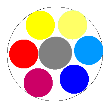
Another way of dealing with the limitations of hue saturation encountered in the three color palette is to use six "primary" colors consisting of six different hues. Typically and/or the traditional primaries and their complements are used as the new six primary colors: blue, green, yellow, orange, red, and violet.
Of course you can also use a six color palette based off of the cyan, yellow, and magenta primaries. Therefore the six hues of pure paint would be cyan, green, yellow, red, magenta, and blue. The selection of red and magenta have to be made with care to ensure that you end up with a "balanced" wheel.
Some of the topics that will discuss in further detail include the hue limitations, desaturation techniques, pigment problems.
© 2006 Marc J. Surrency. surrencystudios.com. Physical or electronic reproduction in whole or part is unlawful without written permission of the artist.
© 2006 Marc J. Surrency. Artist scans, images, and web design are protected by copyright. Physical or electronic reproduction in whole or part is unlawful without written permission of the artist.